
So, what is a brand, and why is having a distinct identity so important?
Marty Neumeier helpfully defines a brand as ‘a customer’s gut feel about a company’. It’s a simple definition which rightly expresses that a brand isn’t just a logo or a set of design principles. It’s bigger than that. The role of branding is to help build positive associations with your audience that can be reinforced over time.
The Process.
A successful brand project comprises a few different steps. From initial discovery, research and strategy all the way through to design and implementation.
One of the critical parts is how you take the initial strategy and translate it into great creative work. Michael Johnson calls this ‘Bridging the Gap’. It might not always be a perfect linear process, but when done right, the result is an impactful brand identity that’s strategically on point and creatively brilliant.
We spoke to Senior Strategist Rich Fishlock and Senior Designer Tan Sagoo about how this do-si-do played out on Catch A Fire’s recent re-brand of charity, Demelza
The Starting Point
Job one is not about creating… it’s about listening and learning.
Typically at Catch A Fire, we start our branding projects by diving deep in three areas: internally with the client team, externally with the customer, and then taking a broader view looking at the category and cultural context.
For the recent Demelza re-brand, we uncovered some fascinating insights and learnings, which formed the base for everything that would come next.
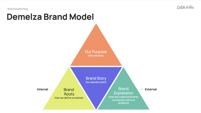
It set the stage for us to make assessments about where the brand was, where they wanted to be, and to collaboratively decide how best to position them for long-term success, all of which we began to capture in a simple brand positioning framework.
Where the magic happens
Taking our learnings, and working with our Creative Director, we built out different brand territories that felt authentic to the organisation, relevant to the audience, and distinctive in a crowded category. It was where left brain met right brain in the process. It enabled us to take our initial strategy and turn the creative dial in different directions.
Once we had narrowed it down to one clear territory with the client’s input and direction, we were in a place to brief our design team with clarity so they could bring it to life.
In the case of Demelza, it was all about highlighting the idea of ‘extraordinary care’.
The brand needed to reflect the passion and professionalism of its staff, whilst presenting a warm and friendly welcome to children and families. So, the name ‘Demelza’ would come to signify a sense of care that doesn’t back down.
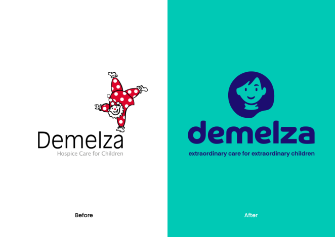
One decision made at this stage was to drop the word ‘hospice’ from the logo, and to shift focus towards language that better captured the positivity, professionalism and joy that exists at Demelza. The end line ‘Extraordinary care for extraordinary children’ was the perfect way to articulate this and move the brand into a bold new space.
Naturally, we went back and forth in this process and there needed to be flexibility. Tan and the team had already brought some aesthetic ideas of their own to the table, to visually evolve the brand. So, the briefing was a chance to align, and provide shape and context to further develop the design thinking. The aim was to produce a visual identity and design system befitting of Demelza, and a way to continually build positive associations over time.
Design: Behind the scenes
From the perspective of design, we had been collating ideas and thoughts from the beginning. The research and brand positioning piece enabled us to spring forward with a clearer idea about where to go next. It provided the nuance and understanding needed to create a sensitive and meaningful brand identity.
We explored several design territories and took the opportunity to see how we could push them visually. This involved looking at different logo ideas which included an evolution of the existing brand icon (clown) with a more modern and refined approach. We also played with the use of hands to show the caring nature of Demelza.
Eventually, we landed on an expression of Demelza herself, whom the charity is named after. We felt this would resonate with children and families, whilst also nodding to the rich heritage of the organisation, to create a symbol of care, that was truly representative of the work they do.
Bring the Brand Identity to life
We experimented with multiple colours, deciding to move away from the use of red to create a more welcoming and caring colour palette. One that would stand out against other charities and give the brand a strong foundation to build from. It was key that the new brand was diverse and relatable so it would appeal to everyone. From internal stakeholders, fundraisers and volunteers, customers on the high street, and the children and families Demelza cares for.
Our aim was to create a flexible brand design that could work across multiple touch points. Everything from brochures, internal presentations, social media, fundraising apparel and collection pots, high street store fronts and signage at the centres.
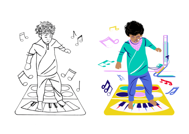
As we developed the brand, a key part was the introduction of character illustrations that brought Demelza and the supporting characters to life. Working with local illustrator Chris Ovens, we created over 40 character illustrations, including Demelza, nurses, fundraisers, children in care and family members.
Take a closer look…
The Demelza project was the biggest brand identity project for the team at Catch A Fire in 2023. It’s something we are enormously proud to have been part of. You can see more of the fantastic work created by checking out our project case study: Helping Deliver Extraordinary Care to Extraordinary Children.